Improve Cumulative Layout Shift (CLS)
It was really busy in Mar and Apr as we welcome our new family member to the world. I am back to the world of Web Performance now. In this article, we will explore how to improve Cumulative Layout Shift (CLS), after we covered First Contentful Paint (FCP) and Largest Contentful Paint (LCP) in the previous articles.
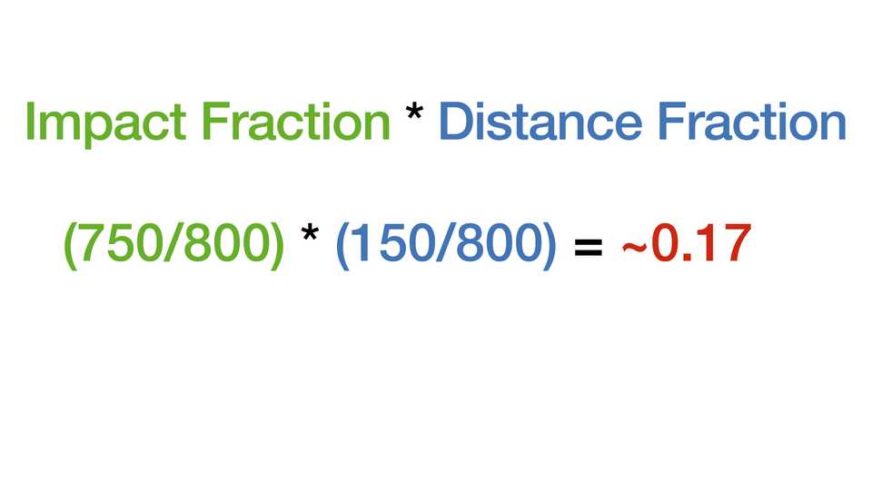
We did mentioned the basic of CLS in the Core Web Vitals article. CLS measures the visual stability of a page. It is the sum of all individual layout shift scores for every unexpected layout shift that occurs during the entire lifespan of the page. A layout shift occurs any time a visible element changes its position from one rendered frame to the next. The score is calculated by multiplying the impact fraction by the distance fraction. Let’s look at how we calculate the CLS score.
CLS Score Calculation
To calculate the layout shift score, the browser looks at the viewport size and the movement of unstable elements in the viewport between two rendered frames. The layout shift score is a product of two measures of that movement: the impact fraction and the distance fraction (both defined below).
layout shift score = impact fraction * distance fraction- impact fraction: the area of the viewport affected by the layout shift (impact size / viewport size)
- distance fraction: the distance the unstable element moved in the viewport (distance / viewport size)
Impact fraction
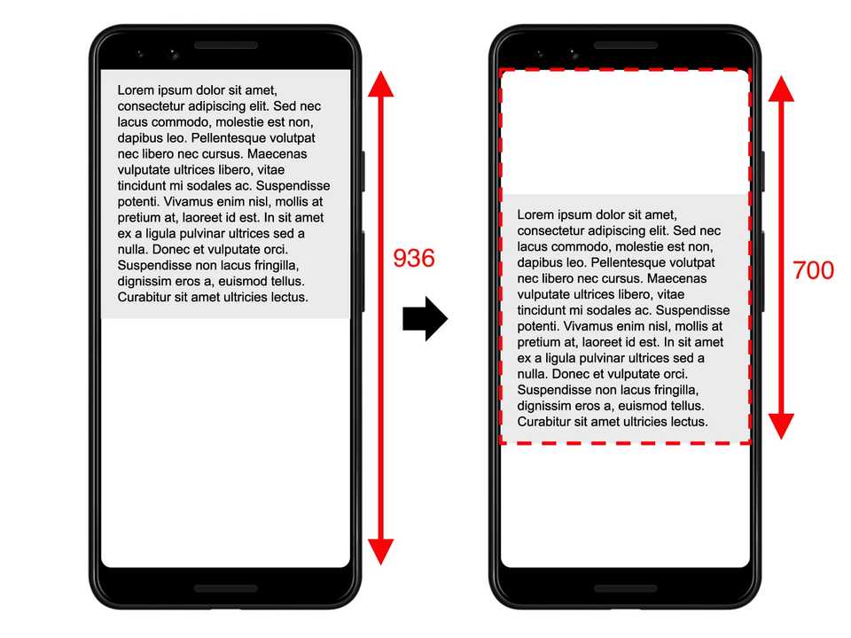
The impact fraction measures how unstable elements impact the viewport area between two frames.
The impact fraction for a given frame is a combination of the visible areas of all unstable elements for that frame and the previous frame, as a fraction of the total area of the viewport.
In this case, the impact size = 700 and the view port size = 936. The impact fraction = 700 / 936 ~ 0.75.
Distance fraction
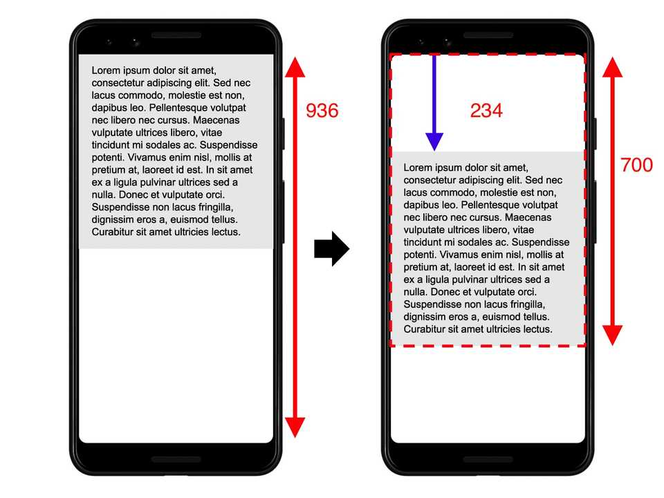
The other part of the layout shift score equation measures the distance that unstable elements have moved relative to the viewport. The distance fraction is the greatest horizontal or vertical distance any unstable element has moved in the frame divided by the viewport’s largest dimension (width or height, whichever is greater).
In this case, the distance = 234 and the view port size = 936. The distance fraction = 234 / 936 = 0.25.
The the layout shift score = (700 / 936) * (234 / 936) = 0.75 * 0.25 = 0.1875.
Example
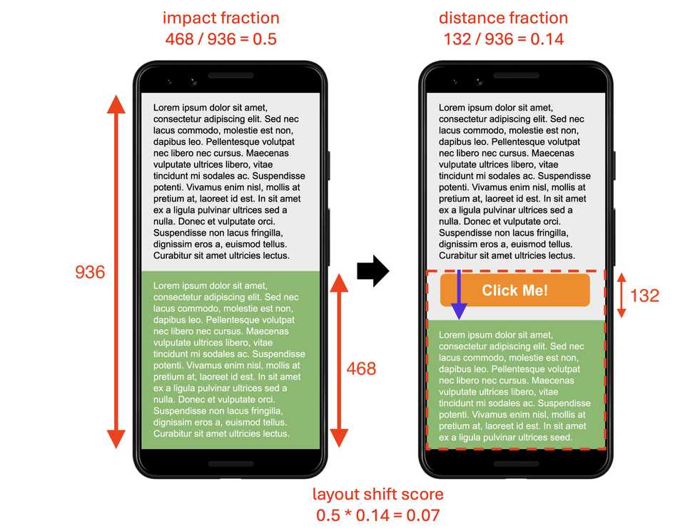
Another example is the layout shift score for a mobile view:
What is a good CLS score?
To provide a good user experience, sites should strive to have a CLS score of 0.1 or less. To ensure you’re hitting this target for most of your users, a good threshold to measure is the 75th percentile of page loads, segmented across mobile and desktop devices.
How to improve CLS?
Layout shifts are caused by elements that move unexpectedly in the viewport. Here are some common causes of layout shifts:
- Images without specified dimensions
- Ads, embeds, and iframes without specified dimensions
- Dynamically injected content
To improve CLS, follow these steps:
- Always add width and height attributes to images, videos, and iframes.
- Reserve space for dynamically injected content using CSS.
- Use absolute positioning for advert banners to prevent layout shifts.
Images without dimensions
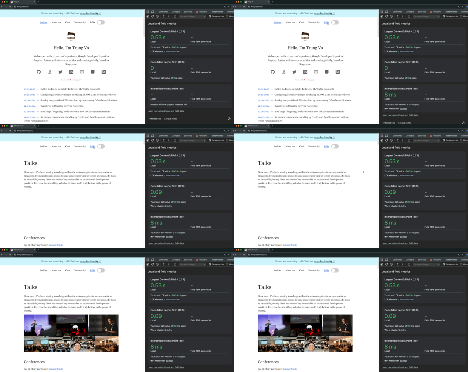
When an image is loaded without specified dimensions, the browser doesn’t know how much space to allocate. Once the image loads, the browser shifts the content to make space, causing a layout shift.
For example, on my blog’s Talks page, the CLS score was 0.09 without specified image dimensions.
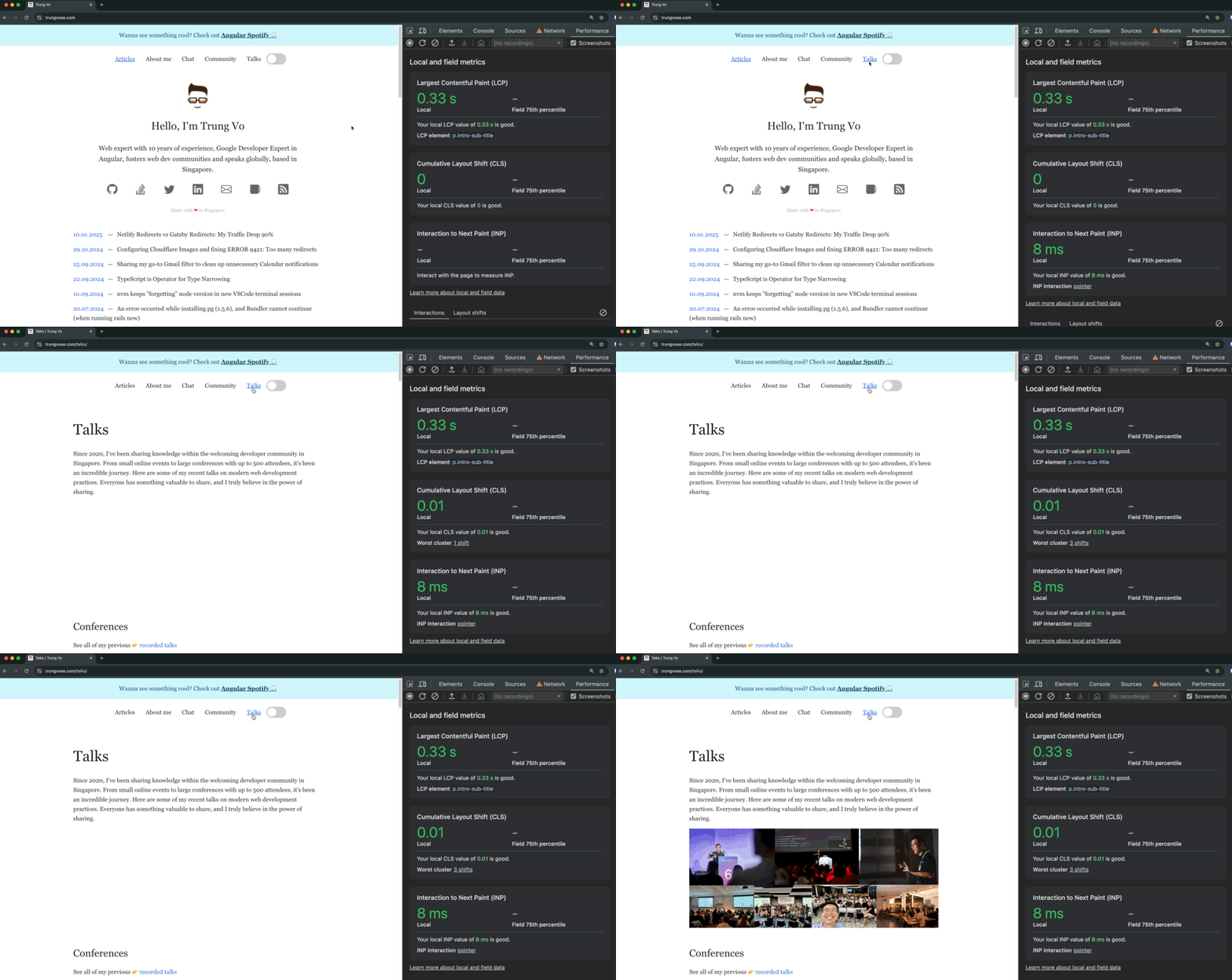
After specifying dimensions, the CLS score improved to 0.01.
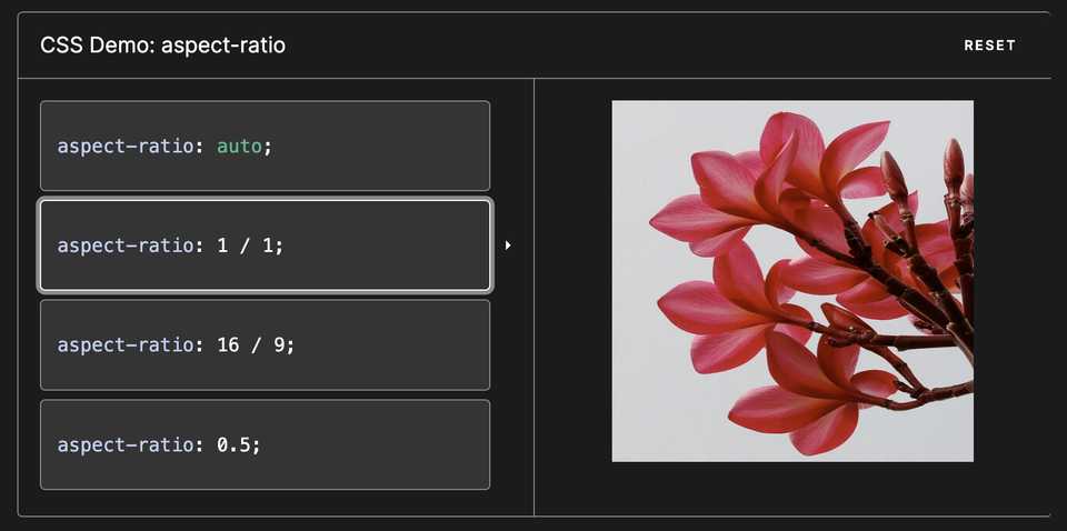
With the new advancement if CSS, you can use aspect-ratio to specify the aspect ratio of an element instead of the fixed width and height. This is useful for responsive images and videos.
img {
  aspect-ratio: 16 / 9;
}
Ads, embeds, and iframes without dimensions
Ads, embeds, and iframes without specified dimensions can cause significant layout shifts. For example, on the New York Times website, content shifts when ads load without dimensions, leading to a poor user experience.

Another example is when you try to click a link, but an ad loads and shifts the content, causing you to click the ad instead.
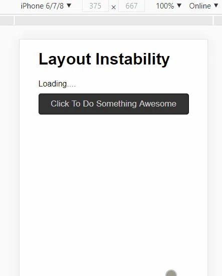
Custom fonts with side-adjust
Custom fonts can also cause layout shifts when they load. The following video shows layout shifts caused by font loading.
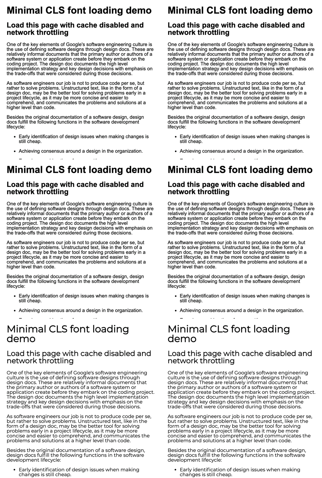
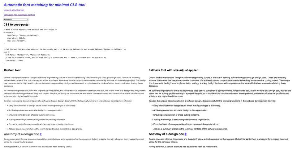
To mitigate this, use side-adjust to match the fallback font to the custom font. Visit Automatic font matching for minimal CLS tool for more information.
Remember, Layout Shift is measured cumulatively
Layout Shift is measured as the sum of all shifts (horizontal and vertical) throughout the page’s lifespan. It is a continuous measurement.
