CSS div jumped when adding a border

TL;DR:
- Using
box-shadowto highlight the div could be a good idea instead of using border.
Adding a border to a div
So, adding a border to a box, is pretty simple when you use the border property. Let’s start a first basic example by drawing a small square and adding a red border to it.
<div class="box border">Border</div>.box {
width: 100px;
height: 100px;
padding: 5px;
margin-bottom: 10px;
}
.border {
border: 1px solid red;
&:hover {
border: 3px solid red;
}
}
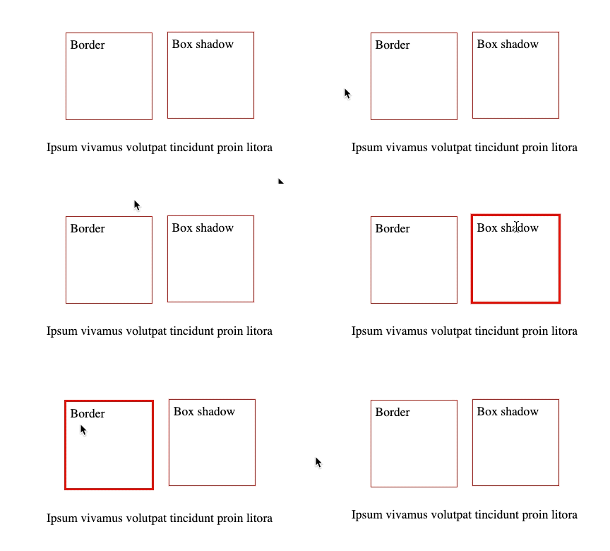
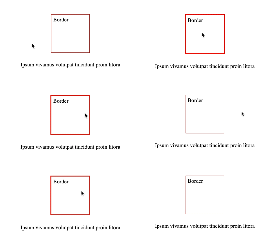
Do you see what’s happening when your mouse is hovering the box? Your content move forward and the rendering is not really great.
If the normal border is 3px and when hover, it is also 3px. You can fix it with a simple trick to set the initial border to 3px transparent and then set the final border to 3px red. But here, we have initial of 1px and on hover 3px. That’s came to the solution below where we use box-shadow instead of border
Using box-shadow
box-shadow: inset | offset-x | offset-y | blur-radius | spread-radius | color;Obviously, box-shadow is a property that is used to add shadow to a box. But we can utilize it to add a border to a box as well.
box-shadow: 0 1px 0 0 red; /* Border bottom */
box-shadow: 0 -1px 0 0 red; /* Border top */
box-shadow: -1px 0 0 0 red; /* Border left */
box-shadow: 1px 0 0 0 red; /* Border right */
box-shadow: 0 0 0 1px red; /* All the borders by using the spread properties */
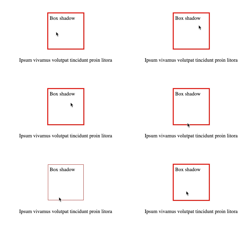
So with that in mind, we can now use the box-shadow to resolve our previous issue. So I added a new box and drawn the borders with the box-shadow property:

<div class="box shadow">Box shadow</div>.shadow {
box-shadow: 0 0 0 1px red;
&:hover {
box-shadow: 0 0 0 3px red;
}
}