Wanna see something cool? Check out Angular Spotify 🎧
Angular v17’s View Transitions: Navigate in Elegance
Angular View Transitions
As users navigate through your site, they’ll appreciate the smooth and polished transitions that keep them engaged. Angular v17 introduces integrated support for the innovative View Transitions API. This API simplifies DOM changes in a single step while generating an animated transition between the two states. You can explore this feature in depth by following Smooth transitions with the View Transition API.
Angular’s Router now includes an optional feature that uses the document.startViewTransition callback to activate and deactivate route, ensuring smooth transitions when navigating between pages. This feature also gracefully handles browsers that do not support view transitions, providing a consistent navigation experience.
To enable view transitions in Angular, there are two approaches. If you are using RouterModule.forRoot, simply set enableViewTransitions to true in the router configuration:
@NgModule({
  imports: [
    CommonModule,
    WebLayoutModule,
    IconModule,
    NoopAnimationsModule,
    RouterModule.forRoot(webShellRoutes, {
      scrollPositionRestoration: 'top',
+     enableViewTransitions: true
    }),
    StoreModule.forRoot(rootReducers),
    EffectsModule.forRoot([ApplicationEffects, PlaylistsEffect, PlaylistTracksEffect]),
    SettingsModule,
    ...extModules
Alternatively, if you are using provideRouter, you can add the withViewTransitions option:
@NgModule({
exports: [RouterModule],
providers: [
provideRouter(
webShellRoutes,
+ withViewTransitions()
)
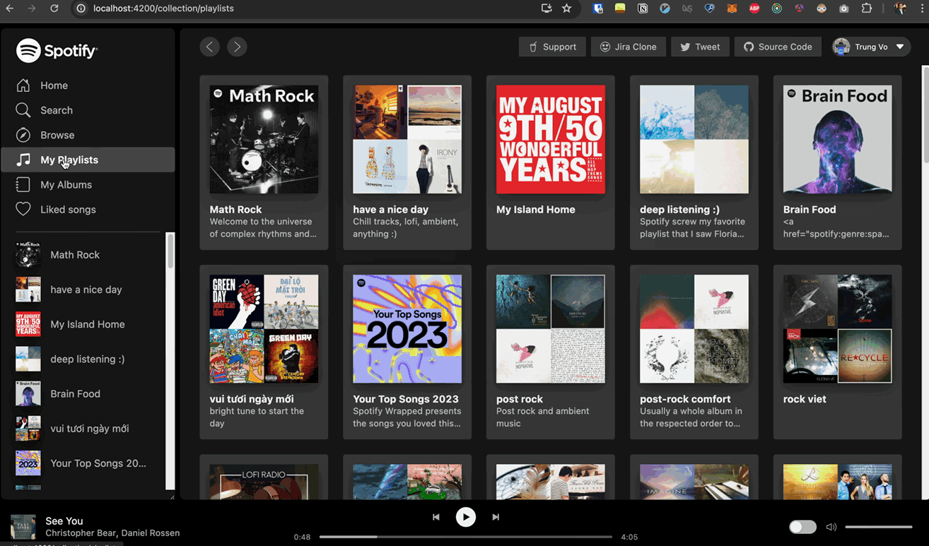
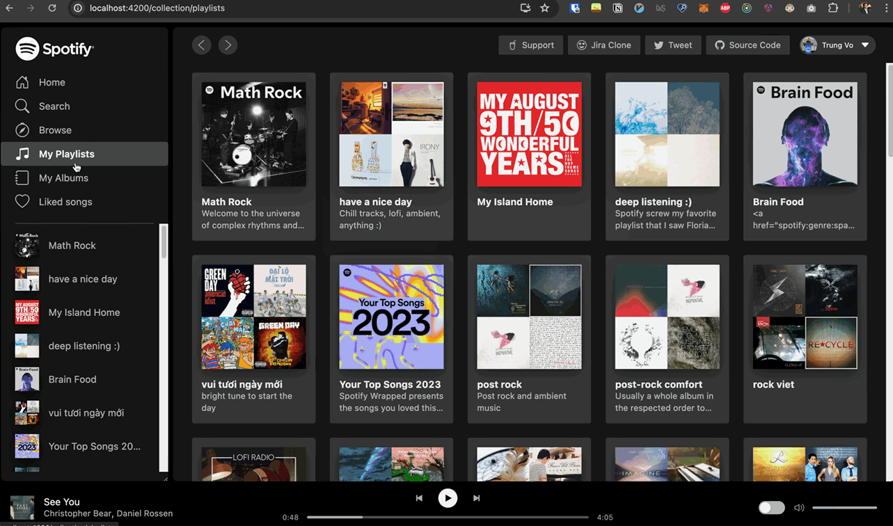
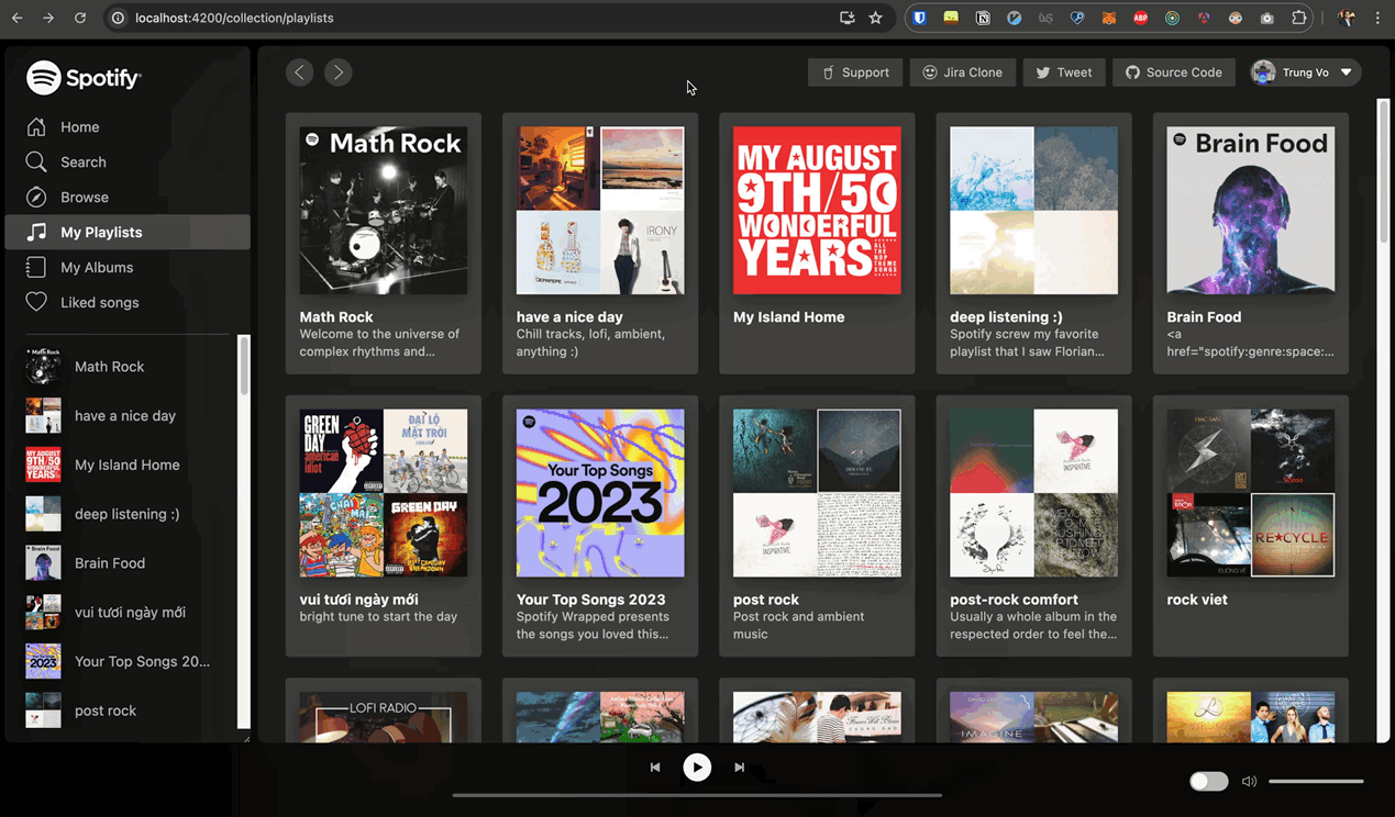
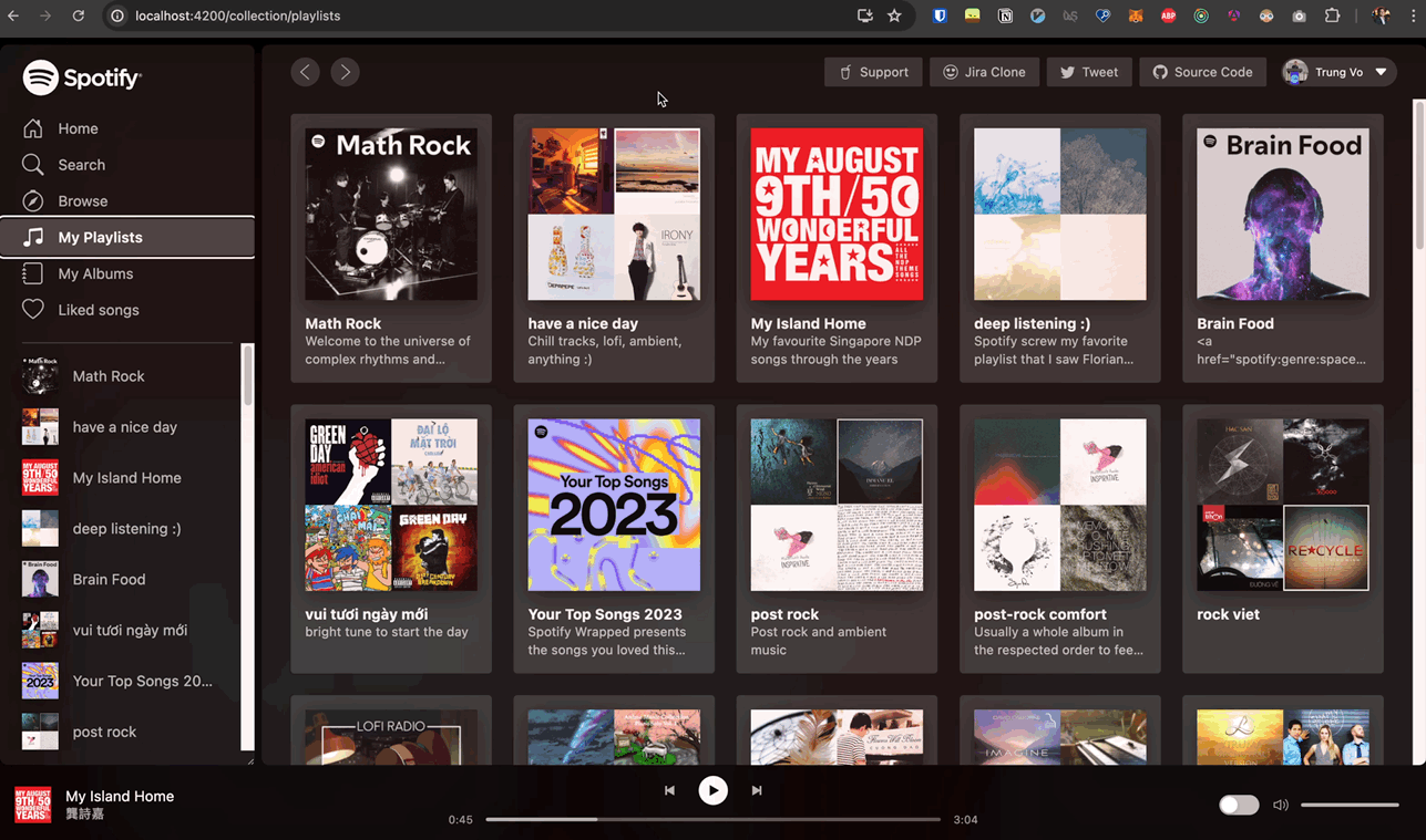
],And just like that, pages cross-fade. The screenshots below demonstrate the view transition effect.
Before
Previously, the page would render immediately when a link was clicked and the route changed
After
However, after enabling view transitions, you can see the faded effect during the transition.
How Do These Transitions Work?
Angular Implementation
When you enable view transitions with enableViewTransitions: true in Angular, it uses withViewTransitions under the hood, as shown in the code snippet below.
packages/router/src/router_module.ts#L157.
static forRoot(routes: Routes, config?: ExtraOptions): ModuleWithProviders<RouterModule> {
  return {
    ngModule: RouterModule,
    providers: [
+      config?.enableViewTransitions ? withViewTransitions().ɵproviders : [],
    ],
  };
withViewTransitions returns a routerFeature with a highlight on createViewTransition.
export function withViewTransitions(
  options?: ViewTransitionsFeatureOptions,
): ViewTransitionsFeature {
  const providers = [
+    {provide: CREATE_VIEW_TRANSITION, useValue: createViewTransition},
    {
      provide: VIEW_TRANSITION_OPTIONS,
      useValue: {skipNextTransition: !!options?.skipInitialTransition, ...options},
    },
  ];
  return routerFeature(RouterFeatureKind.ViewTransitionsFeature, providers);
}
createViewTransition calls document.startViewTransition, but the DOM isn’t updated within the transition callback as usual. Instead, it synchronously activates and deactivates routes during the transition. This is the only place in the Angular codebase where document.startViewTransition is used.
packages/router/src/utils/view_transition/view_transition.ts#L121
/**
 * A helper function for using browser view transitions. This function skips the call to
 * `startViewTransition` if the browser does not support it.
 *
 * @returns A Promise that resolves when the view transition callback begins.
 */
export function createViewTransition(
  injector: Injector,
  from: ActivatedRouteSnapshot,
  to: ActivatedRouteSnapshot
): Promise<void> {
  const transitionOptions = injector.get(VIEW_TRANSITION_OPTIONS)
  const document = injector.get(DOCUMENT)
  // Create promises outside the Angular zone to avoid causing extra change detections
  return injector.get(NgZone).runOutsideAngular(() => {
    if (!document.startViewTransition || transitionOptions.skipNextTransition) {
      transitionOptions.skipNextTransition = false
      // The timing of `startViewTransition` is closer to a macrotask. It won't be called
      // until the current event loop exits so we use a promise resolved in a timeout instead
      // of Promise.resolve().
      return new Promise(resolve => setTimeout(resolve))
    }

    let resolveViewTransitionStarted: () => void
    const viewTransitionStarted = new Promise<void>(resolve => {
      resolveViewTransitionStarted = resolve
    })
    const transition = document.startViewTransition(() => {
      resolveViewTransitionStarted()
      // We don't actually update dom within the transition callback. The resolving of the above
      // promise unblocks the Router navigation, which synchronously activates and deactivates
      // routes (the DOM update). This view transition waits for the next change detection to
      // complete (below), which includes the update phase of the routed components.
      return createRenderPromise(injector)
    })
    const { onViewTransitionCreated } = transitionOptions
    if (onViewTransitionCreated) {
      runInInjectionContext(injector, () =>
        onViewTransitionCreated({ transition, from, to })
      )
    }
    return viewTransitionStarted
  })
}
In Angular, a single-document view transition is applied for SPAs, as it runs within a single document, animating changes to the DOM when navigating between routes. However, when using server-side rendering (SSR), we may need to incorporate cross-document view transitions.
To achieve cross-document view transitions, we can utilize the document.startViewTransition method and pass a callback that updates the DOM. The transition is considered complete when the callback returns a promise that resolves once the DOM has been fully updated.
View Transition API
To trigger a same-document view transition in JS, we use:
function handleClick(e) {
  if (!document.startViewTransition) {
    updateTheDOMSomehow()
    return
  }

  document.startViewTransition(() => updateTheDOMSomehow())
}
When invoked, the browser captures snapshots of all elements with a view-transition-name CSS property. After the callback updates the DOM, it takes snapshots of the new state and constructs a pseudo-element tree like this:
::view-transition
└─ ::view-transition-group(root)
   └─ ::view-transition-image-pair(root)
      ├─ ::view-transition-old(root)
      └─ ::view-transition-new(root)
These snapshots transition smoothly from their old to new states, while their content crossfades. The ::view-transition sits as an overlay on the page, useful for setting a background colour for the transition.
::view-transition-old(root) is a screenshot of the old view, and ::view-transition-new(root) is a live representation of the new view. The old view animates from opacity: 1 to opacity: 0, while the new view animates from opacity: 0 to opacity: 1, creating a crossfade. All animations are performed using CSS, allowing for customisation.
How Long is the Default Crossfade Transition Animation?
The default crossfade transition animation in Angular lasts 250ms, according to the W3C documentation. You won’t easily find this information on Google, but it is specified in the 5. User Agent Stylesheet.
:root {
  view-transition-name: root;
}

:root::view-transition {
  position: fixed;
  inset: 0;
}

:root::view-transition-group(*) {
  position: absolute;
  top: 0;
  left: 0;

+ animation-duration: 0.25s;
  animation-fill-mode: both;
}
You can customise the duration of the crossfade transition using CSS, as explained in the next section.
Using CSS to Customise Transitions
All view transition pseudo-elements can be targeted with CSS. Since the animations are defined using CSS, you can modify them using existing CSS animation properties. For instance, to slow down the animation to 5 seconds, use the following CSS:
::view-transition-old(root),
::view-transition-new(root) {
  animation-duration: 5s;
}
This change makes the fade much slower. As shown in the video below, the ::view-transition appears on top of the page.
Customising ::view-transition-old
If you want to customise the transition for the old view only, apply changes to the ::view-transition-old(root) pseudo-element. Note that extending the old view’s duration can cause visual issues, such as a flashing effect when the old view disappears while the new view appears quickly.
::view-transition-old(root) {
  animation-duration: 5s;
}
Customising ::view-transition-new
Similarly, you can customise the transition for the new view only. This is useful if you want the new view to appear slowly. In this case, the new view will appear in 5 seconds while the old view disappears in 250ms default duration. However it creates a black screen before the new view fully appears.
::view-transition-new(root) {
  animation-duration: 5s;
}
Further Customising the Transition
You can customize the animations using CSS instead of using the default fade-in and fade-out animation. If you’re curious about how the default fade-in animation works, you can read more about it in the -ua-view-transition-fade-in.
To apply a slide effect, you can use the following CSS:
@keyframes slide-from-right {
  from {
    transform: translateX(300px);
  }
}

@keyframes slide-to-left {
  to {
    transform: translateX(-300px);
  }
}

::view-transition-old(root) {
  animation: slide-to-left 5s ease;
}

::view-transition-new(root) {
  animation: slide-from-right 5s ease;
}
Notice that the entire page shifts, causing a double side nav bar effect during the transition. To avoid this, either animate the content only or use a less disruptive animation. The Chrome team provides an example of a fancy animation.
@keyframes fade-in {
  from {
    opacity: 0;
  }
}

@keyframes fade-out {
  to {
    opacity: 0;
  }
}

@keyframes slide-from-right {
  from {
    transform: translateX(30px);
  }
}

@keyframes slide-to-left {
  to {
    transform: translateX(-30px);
  }
}

::view-transition-old(root) {
  animation: 90ms cubic-bezier(0.4, 0, 1, 1) both fade-out, 300ms cubic-bezier(
        0.4,
        0,
        0.2,
        1
      ) both slide-to-left;
}

::view-transition-new(root) {
  animation: 210ms cubic-bezier(0, 0, 0.2, 1) 90ms both fade-in, 300ms
      cubic-bezier(0.4, 0, 0.2, 1) both slide-from-right;
}
Transitioning Multiple Elements
To avoid transitioning the entire page, you can animate specific elements separately by assigning a view-transition-name to the element.
.media-cover {
  view-transition-name: media-cover;
}
The view-transition-name must be unique on the page, following the specs

For example, on a listing page with 10 playlists, each displayed with an ID from 1 to 10, you can’t use the same view-transition-name for every playlist cover. Here are two ways to handle this unique name issue:
1. Set Each Element’s Name Dynamically
For example, on the listing page, assign the name based on the playlist ID.
@for (playlist of playlists.items; track playlist) {
  <as-card
+   [style.view-transition-name]="'media-cover' + playlist.id"
    [title]="playlist.name"
    [uri]="playlist.uri"
This way, each playlist cover on the listing page will have a unique name. On the detail page, there will only be a single media cover displayed with the name media-cover-1, for example.
2. Assign the Name Dynamically During the Transition
Alternatively, when the user clicks on an playlist cover, the name will be assigned dynamically. For example, by default, no cover on the listing page will have view-transition-name. When an playlist is clicked, the name media-cover will be assigned to the current active playlist cover, making the transition apply only to the active cover.
The pseudo-code looks like this:
thumbnail.onclick = async () => {
  thumbnail.style.viewTransitionName = 'media-cover'

  document.startViewTransition(() => {
    thumbnail.style.viewTransitionName = ''
    updateTheDOMSomehow()
  })
}
Using onViewTransitionCreated in Angular
We will try to implement the second approach in Angular.
Angular’s withViewTransitions feature can be used with an options object that includes an onViewTransitionCreated callback. This callback runs in an injection context and receives a ViewTransitionInfo object.
Here’s an example using onViewTransitionCreated:
bootstrapApplication(App, {
  providers: [
    provideRouter(
      routes,
      withComponentInputBinding(),
+     withViewTransitions({ onViewTransitionCreated })
    ),
  ],
})
function onViewTransitionCreated(info: ViewTransitionInfo) {
console.log(info)
const currentTransitionService = inject(CurrentTransitionService)
currentTransitionService.currentTransition.set(info)
info.transition.finished.finally(() => {
currentTransitionService.currentTransition.set(null)
})
}
@Injectable({
providedIn: 'root',
})
export class CurrentTransitionService {
readonly currentTransition = signal<ViewTransitionInfo | null>(null)
}Now you have the currentTransition object, which contains the from and to routes. You can use this information to dynamically assign the view-transition-name to the element you want to transition.
@for (playlist of playlists.items; track playlist) {
  <as-card
+   [ngClass]="viewTransitionName(playlist)"
[title]="playlist.name"viewTransitionName(item: SpotifyApi.PlaylistObjectSimplified) {
const transition = this.transitionService.currentTransition();
const transitionAlbumId = getViewTransitionParamValue(
transition,
RouterUtil.Configuration.PlaylistId
);
const withViewTransition = transitionAlbumId === item.id;
return withViewTransition ? 'with-view-transition' : '';
}I used the with-view-transition class on the parent element of the media-cover component instead of directly on the media-cover component itself. This allows me to reuse the media-cover component in multiple places without applying the view transition directly to it.
I learn this approach from github.com/Charca/view-transitions-live/src/styles/styles.css#L1
.with-view-transition as-media-cover {
  view-transition-name: media-cover;
}
The complex part is getViewTransitionParamValue, considering how Angular Spotify is structured. Here’s the relevant code comment:
/*
  The reason for accessing the third firstChild is due to the route structure. For example, when rendering AlbumComponent:
  AppComponent
    LayoutComponent
      /album (lazy loadChildren)
        /:albumId (lazy loadChildren)
  Thus, when receiving transition.from or transition.to, only the AppComponent route snapshot is received.
  Therefore, accessing transition?.from.firstChild?.firstChild?.firstChild allows accessing the params.
  In this case, the albumId param is available.
*/
export function getViewTransitionParamValue(
  transition: ViewTransitionInfo | null,
  param: string
) {
  if (!transition) {
    return null
  }

  return (
    transition.from.firstChild?.firstChild?.firstChild?.paramMap.get(param) ||
    transition.to.firstChild?.firstChild?.firstChild?.paramMap.get(param)
  )
}
For more details, see my PR #97 - View Transition Playground.
Result
Regardless of whether you choose to set the name dynamically or during the transition, the outcome remains the same: only the active album cover will transition, while the others remain static.
Even if JavaScript is disabled in the browser, the transition will still work as expected since it relies on the browser’s built-in capabilities.
When debugging with the animation panel, the timeline of media-cover looks like this:

Notice the new ::view-transition-group with the name media-cover, which only contains the active album cover, and the built-in animation name ua-mix-blend-mode-plus-lighter defined in the W3C documentation.
According to 7.3.3. Setup transition pseudo-elements in the documentation, the above animation in the timeline follows the algorithm steps precisely. You’ll see:
- Step 6: The
-ua-view-transition-group-anim-media-cover - Step 8:
-ua-view-transition-fade-out,-ua-mix-blend-mode-plus-lighterfor::view-transition-old(media-cover)and::view-transition-new(media-cover)
As we observed, ::view-transition-old(media-cover) captures the media cover moving from the listing page to the detail page, which is a great start. However, we can further enhance the transition by applying a custom animation to the media-cover element. For example, if we add a spin animation to the media-cover element, the result will be as follows:
@keyframes spin {
  0% {
    transform: rotate(0deg);
  }
  100% {
    transform: rotate(360deg);
  }
}

::view-transition-new(media-cover) {
  animation: spin 500ms;
}
Demo & Source code
Feel free to give it a ⭐️.
Official W3C Documentation
As I have went through the ocean of resources before publishing this articles, I would the W3C should be still a single source of truth to truly understand the View Transitions API with some niche questions you might have in mind e.g how long is the default animation duration and the like. Here are the links to the official documentation
- For same view transitions, you can refer to the CSS View Transitions Module Level 1 documentation
- For cross-document view transitions, you can refer to the CSS View Transitions Module Level 2 documentation
- Check out Angular’s support for the View Transitions API
Conclusion
Angular v17’s View Transitions API is a powerful tool that enables you to create smooth transitions between pages. By enabling view transitions in Angular, you can provide users with a more engaging and polished experience as they navigate through your site. While the Angular implementation is straightforward, there is much more to explore and discover with the View Transitions API. I hope this article has provided you with a solid foundation to dive deeper into this exciting feature.
Published 22 Jun 2024